Comics, especially X-Men comics, and trading cards have a long history together. The X-Men trading cards, followed by the larger Marvel sets, started right as the comics hit their most financially successful period. Trading cards were included in some of the biggest launches, like X-Force #1 and X-Cutioner’s Song. Marvel’s acquisition of the trading card producer Fleer significantly contributed to their bankruptcy claim in the mid-90s.They are tied, specifically, to a time many fans hold fond memories for, a golden age people long to return to.
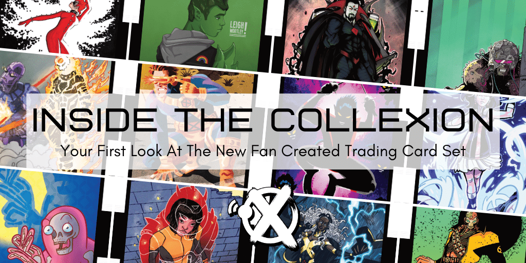
Now, as the Dawn Of X has brought back many lapsed comics fans, there is a new set of trading cards for a new generation. The ColleXion is a 58 card set from 27 fan artists depicting characters from across the nearly 60 year history of the X-Men. Project curator Scott Modrzynski credited the idea for the set from just talking to other artists on what they affectionately call “X-Twitter”. Driven partly by nostalgia and partly by the sense of community the artists had found, Scott put out the call for other artists and soon found himself deep in a new project. “It was literally tackling one fire after the next as they appeared. Really no plan at all until the time came to make a plan. I think 16 years in advertising and sports has completely ruined me that way. No minute is important until the last minute.”

Where some older sets were held together by their stylistic consistency, The ColleXion celebrates a diversity of artistic vision. There’s traditional inked and colored drawings, acrylics, photography, digital painting, and even wood burned art. This wide range of styles was important to Modrzynski. “I just don’t think there is any right way to make art. No, not all of these styles would “fit” in what we all consider comic book art, but they do have their place at the table. […] We had plenty of Storms and Rogues and Gambits. We needed more Marrows and Skins and Toads. […] There’s also something to be said for all these different vibes coming together under one banner to form a single, cohesive thing. In very broad terms, that’s the definition of the X-Men.”

Not all the aspects of the cards were so experimental. The design of the frames and cardbacks is a mix of the Jonathan Hickman and Tom Muller data pages in the current X-Men books with the iconic frame design from the old Jim Lee set. The card backs, however, were a bit different. Written by Austin Gorton, Trent Seely, and Dave Shevlin, these pulled some of the best bits from previous, official, sets like quotes and stats, while adding new features like the reading list for each character. Conveniently, the PDF version of the cards are linked to the Marvel website, allowing fans to just tap a story and read it on Marvel Unlimited.

Looking at the list of subjects, it’s not all the most obvious suspects. Sure there are your Magnetos and Storms, but mixed in with odd-balls like Tempus and Mondo. Scott had the artists take point on their assignments. They submitted their top choices, and most of them got both characters they wanted. This allowed The ColleXion to celebrate fan favorites, and gave artists a chance to draw exactly what they wanted. Scott trusted the artist with the character directions and it truly paid off.

To celebrate this project, we are highlighting ten different cards by ten different artists that span a wide range of styles by interviewing the artists behind them.
Elixir

Xavier Files: The colors on this card are striking, almost hyper-saturating the piece with gold. What makes this an appealing technique for you to utilize?
Leigh Wortley: I really enjoy using bright colours in my work. My current webcomic is in grey scale with spot colour so it’s nice to get that contrast in illustrations.
Also, it’s Elixir! He needs to be gold to stand out against the other blonde haired blue eyed heroes. – I also like giving him white pupil less eyes just to stand out more and show part of the changes he’s been through as a character.
XF: You specifically drew a Dawn Of X era Elixir. How do you think the different era’s impact your depiction of the subject?
LW: Lots of readers know Josh as part of one of the Krakoa 5. Right now he’s not necessarily a character but a plot point. (That isn’t a bad thing! It’s hard in a 50+ year span of characters to constantly keep characters at the forefront and not to be ‘dreaded’ wallpaper.) I’d also drawn Anole in casual wear and wanted my other piece to be more ‘on brand’ x-men wise.
Husk

XF: There’s a lot of energy in this piece. How did you decide to frame the shot like this?
Karen Charm: I did three cards for the set, and I sketched it out so that when put side by side they would kind of flow compositionally. Otherwise, I mean, the old Marvel trading cards are what made me fall in love with the X-Men in the first place, and so I wanted to try and make my favorite characters look as cool as possible. So I wanted to do some kind of dynamic pose, and it was just a matter of figuring out what Husk could be doing (putting her in a corn field seemed like too good a gag to pass up).
XF: There’s a lightness, a fun to every piece you do. How do you balance that when you have a subject like Husk with an inherently uncomfortable power-set?
KC: I don’t know if there’s anything specific I can say about that, it’s just the way I draw – it’s more cartoony. Also my personality too, probably. It’s funny, I guess I don’t ever really think about Husk’s power as being uncomfortable – I get that’s it’s supposed to be gross but I’ve always just thought it could be so amazing. The Husk we get to see in [Ed. note: Husk co-creator and designer Chris] Bachalo’s early promo art and in Generation Next was so amazing and sadly Paige the Rage hasn’t quite gotten to live up to that potential since. Anyway, all that is to say I wanted to show the Husk that I know she can be if a creator ever decides to really invest in her. Oh, also, I decided that since she’s Cannonball’s sister she should have big ears, so maybe that makes it more fun.
Gambit

XF: What does pyrography allow you to do in this depiction of Gambit that you couldn’t have done in another medium?
Michael O’Shields: When I first started out working the comic convention scene, I was amazed at how many talented artists there were and how competitive it was to get attention. Wood burning is an artform that takes a long time to finish a single piece and wasn’t represented. So I thought that’s how I will be different from everyone else. Woodburning allows you to create some texture within the piece itself. For example, the folds of the jacket can be felt with your fingertips as you run your hand across the surface of the wood.
XF: This is a sister piece to your Rogue card in the set. What steps did you take to keep these two pieces connected?
MO: When Scott assigned me Rogue and Gambit I got excited! These two have been linked together since they met in “Muir Island Saga.” If I was lucky enough to get the both of them then I knew they had to be linked together somehow! My first thought was to have each exploding from opposite corners so that when they were put together it would look like one whole piece. That didn’t quite come together visually for me. The card motif is always part of Gambits persona so I thought why not have a card behind each of them that had the opposite portrait but done in the style of playing cards! Scotty was going to have headshots on the back of the cards for each character and we thought having that small portrait come from the other piece would tie them together nicely!
Apocalypse

XF: This is a visually distinct piece that almost feels carved from stone. It’s mythic and very appropriate for Apocalypse. What were your inspirations to develop this style?
Millo Sketch: In the development of this style I have a big influence from the graphic work of woodcuting in my country (México), there are some famous artist here that have worked in this style like Leopoldo Mendez, Francisco Toledo and probably the most popular José Guadalupe Posada creator of one of our most representative icons “La Catrina”. I spend some years practicing this kind of technique until the time of working on digital stuff arrived, I do an emulation of this style through the digital working process on Photoshop. I began to create some fan arts on this software and received an invitation to create a representation of this great character (Apocalypse).
XF: Can you describe your inspiration for the setting of this card? It seems like less of an action shot than a depiction of a god creating.
MS: I really enjoy working on supervillains! The inspiration comes from a curious mixture between Bengus’ work (concept artist in Marvel vs. Capcom arcade game) and the end-credits scene from X-men “Days of Future Past” in the first appearance of a young Apocalypse probably building that pyramid. It was a blast in my mind, trying to figure out a picture of this supervillain showing his power in a solid way.
Magneto

XF: This is one the pieces in this set that would most easily fit into the classic 90s trading card set. Were you pulling inspiration from some of those pieces? If not, where?
Lee Nycz: Loved trading the cards and comics. Especially Spidey. Especially McFarlane. When I was working on Magneto I was looking at a lot of Bill Sienkiewicz stuff and Apocalypse art.
XF: Why did you decide on Age Of Apocalypse Magneto over a more traditional depiction?
LN: I read Age of Apocalypse in High School and thought it was pretty fucking cool. Love all the alternate universe/ timeline stuff. Also dope ponytails.
Psylocke

XF: Photographing action figures is an interesting challenge since you are limited by what the plastic can do. How do you manage those limitations to create such a powerful image?
Brandon Deichler: Action figure collectors in 2020 are really lucky because so many companies make high quality, highly articulated X-Men figures. That really eliminates a lot of the limitations action figure posing has compared to traditional mediums. In some ways, this medium has an advantage because the proportions are always correct and one just has to make sure that posing looks natural, the lighting looks dramatic, and the scenery is interesting.
I’ve always been jealous of people who can draw or paint, so that is a big drive for me to flex my creative muscles in this alternative way.
XF: What post production work goes into a photograph like this?
BD: I practice a very specific style of figure photography called Articulated Comic Book Art. The hallmark of this style is actually the complete lack of post-production. Everything seen is done on camera. Smoke is from a smoke machine, rain is from a spray bottle, speech bubbles and sound effects are not digitally added but are printed and photographed within the scene. Think of it as practical effects vs CGI.
Nature Girl

XF: Your style has a heavy use of texture and light to fill the background and frame as opposed to hard lines like you use on the figure. Why did that make sense to you for this piece?
Michi: Honestly the composition for the NATURE GIRL card was one that I struggled with a lot as I went through multiple iterations of the sketch while trying to find something that worked. The original idea I had was trying to find a balance between how the viewer often sees Lin portrayed in comics versus the idea that I had of her in my head, a sort of a mix of the two. The final product was mostly a case of reaching a point of artblock and resorting to throwing things on the canvas to see what worked best. For this card in particular, I started off with the background first before sketching Lin – sometimes focusing on working with different brushes as opposed to line art makes it easier for the composition to be put together – essentially, the textures evoked the mood of the piece, and then putting Lin in there was like finding the last needed puzzle piece to finish things off.
In regards to hard lines for Lin, using a more muted/darker background, it would have been very easy for her to be “lost” in the background if I hadn’t made her stand out via the lines – it was sort of a accident, usually my lines vary from piece to piece depending on what program I use and what brushes I use – in this case, I felt it sort of encapsulated Lin as a character – she’s often seen as a “background” character even when she’s given moments to shine, so I wanted to make her stand out in a composition where she’s essentially one with the forest, but still stands out on her own.
XF: You previously did a Marvel fashion zine. How does that sense of fashion inform this piece?
M: The Marvel fashion zine is a project that I did on and off for about 4 years or so, it was one part a passion project, one part failure, one part learning experience, haha. I do plan on revisiting and reworking it entirely, but when you draw over 100+ sketches and ideas of fashion iterations for different characters, it leaves something in you even if it’s not a actively conscious thing. In this case, I originally thought I’d draw Lin in her usual uniform but instead I decided to redesign it slightly while still keeping to the “suit” aesthetic of her uniform. It was more so a rework of how would a revamped version of her uniform fit into a more flow-y sort of composition, which is how I came up with the design that I used for the card – it’s subtle but there are some gold accents to break up the monochrome style of her uniform, but also plays well with the overall composition of the piece itself by balancing a monochrome color palette with the more muted palette of the background – essentially it’s the little accents and colors that tie the whole piece together, which is what I had in mind when working on it.
Havok

XF: Why do you think Havok works so well with a more abstract, cartooning style verses more traditional line work?
Joshua Nelson: It’s definitely the duality of how simple his costume is and how easily him using his power takes over a drawing, cover or page. He was one of the first characters I remember seeing artists taking a lot of license with prior to the Image generation, most notably Jon J Muth & Kent Williams’ work on “Wolverine & Havok: Meltdown” but I saw that even Neal Adams used the character as an opportunity for flourishes in page and cover design.
XF: In both your pieces in the set (Joshua also did Sunspot), you use screentone to add texture. What is appealing about that technique for you?
JN: Beyond simply loving the look, I like that it’s something harkening back to the grand tradition of cartooning and how it gives any drawing a look that is so “of comics”. I really thought it had fallen out of favor forever beyond manga, the occasional indie B/W book, and American OGNs, where for some reason that doesn’t seem to be a hindrance to readership. It’s been heartening to see it make such a comeback in the past decade or so, being infused either by artists working digitally, doing the old fashioned cutting of the stuff onto their original art, or having it added by a colorist during that step of production.
Artie & Leech

XF: Scott, you work in multiple mediums. What came first, wanting to do an Impressionistic piece and thinking Artie & Leech would be good subjects or starting from the characters and deciding what style would best fit them?
Scott Modrzynski: I developed my visual style painting Muppets, so this impressionistic look is inherently tied to weird, not-quite-human characters to begin with. Artie and Leech fit that mold as well as any X-Men characters might. Plus, I didn’t think anyone would ever choose them, and as the producer of this set, I didn’t want to steal away an A-list character from a superior artist who would have done a better rendition anyway. In retrospect, I should have painted my Fitzroy piece in my personal house style as well.
XF: What’s the story behind setting this piece in a log flume ride?
SM: I grew up on the Wildwood, NJ boardwalk. Hitting the go karts under the boardwalk, and the roller coasters over it any random day or night all summer is an unparalleled blast I will keep with me forever. Even in adulthood, screaming with glee as your stomach swings up into your throat never lost its luster.
So putting Artie and Leech in this joyous setting felt very right. The log flume, specifically, felt like something a Krakoan theme park might have. I knew I “got it” after I moved the finished piece from my easel to the storage rack. My toddler saw a new painting on the easel and got upset. It took a minute to figure out what he wanted, but it was Artie and Leech. Every time that little guy sneaks his way into my home studio, I give him the painting, and he walks around with it like its a teddy bear. He has no idea who these pink and green dudes are, but he loves them. Make some A&L plush dolls, Marvel.
Catseye

XF: Why LEGO?
Quinn Hesters: The reason I use LEGO mostly boils down to my desire to create visual art and my inability to draw well. I was fascinated by LEGO as a kid, but a big part of what drew me back in as an adult was stumbling upon digital building programs. They allow you to use any piece in any color, including ones that don’t exist in real life. This allows for a lot of creative problem solving when “sculpting” certain iconic characters. For example, a lot of the Cyclops designs I make have a visor that uses a yellow or silver version of a roundish baseplate intended for the toy soldier minifigs in an old Toy Story set. Piece 88000, to be precise.
I also just love little stylized collectable figures, and I decided to use the template of LEGO’s Brickheadz, a line that’s a shameless attempt to ride the coattails of the Funko POP craze. I wanted to bring that minimalist style to characters that would never get Brickheadz or Funko POP figures in a million years, like La Nuit, Will.i.am’s character in X-Men Origins: Wolverine, or everyone’s favorite Hellfire Club guards, Harvey and Janet.
XF: Your other pieces in this set are robots (Sentinel and Danger), which make a lot of sense in a brick based medium. What drew you to Catseye as a subject?
QH: Scottie decided that mechanical figures would best suit my style, so I did Danger and a Sentinel for my first two cards. However, when he said that we could choose third characters, I just wanted to do someone more “organic”. However, I also didn’t want to pick a character that anyone else might want to do, because I didn’t want to prevent more talented artists from creating a more detailed depiction of that character.
A few self-rejected ideas later, I remembered an episode of the Mutant Musings podcast where they gushed about an obscure character that people actually like: Catseye. I had recently been reading the New Mutants issues where she and the other Hellions first appeared and I immediately fell in love with her bizarre design. I thought Catseye’s ability to transform would allow me to bring something unique to my card design-wise. The decision to show her shifting forms was inspired by the covers to the Animorphs book series.
If you want to check out the whole set, it is available to download on Scott Modrzynski’s portfolio page.
Just for transparency, many people involved with this project, including Scott Modrzynski, have provided financial support to Xavier Files in the past, have, like Austin Gorton, Trent Seely, and Kenneth Laster, written for Xavier Files, or are co-hosts of Battle Of The Atom, like Adam Reck. What can we say, it’s a small community but this project is dope.
Zachary Jenkins runs the Xavier Files Media Empire and is a co-host on the podcast “Battle of the Atom.” Shocking everyone, he has a full and vibrant life outside of X-Men.

Zachary Jenkins co-hosts the podcast Battle of the Atom and is the former editor-in-chief of ComicsXF. Shocking everyone, he has a full and vibrant life outside all this.