X-Men writer Jonathan Hickman has a passion for graphic design. His love of charts has become nearly as memetic as his pithy interviews. Since we at ComicsXF are evolving our graphic design with the relaunch, we figured it was the perfect time to invite Jon over to talk about charts.
Zachary Jenkins: Design elements have been part of your comics work all the way back to the Nightly News. That was a book largely about cable news media, so the pop-ups, chyrons, and charts thematically made sense. What drove you to apply those techniques to your other, more mainstream work?
Jonathan Hickman: Well, I think there’s a pretty big difference between what I was doing then and what I’m doing now. In the Nightly News (and Pax Romana), I was really trying to combine comics and graphic design into a single ‘cohesive’ narrative. It works in some places, in others it doesn’t. It’s certainly visually interesting in that it reads differently than a straightforward comic, but as I’ve gotten better over the years, I generally think narrative clarity is more important than me screwing around or experimenting with a wider audience.

Next time I draw a book I’ll play with that a bit more and we’ll see if I’ve figured some stuff out. I think I have, and it’s why I pulled that Image book I was writing and drawing, Frontier, as it needed to bake some more (and have a bit of a format change — it was mostly digital, so I don’t have to throw away the 80-something pages I had done, but I’m switching things up).
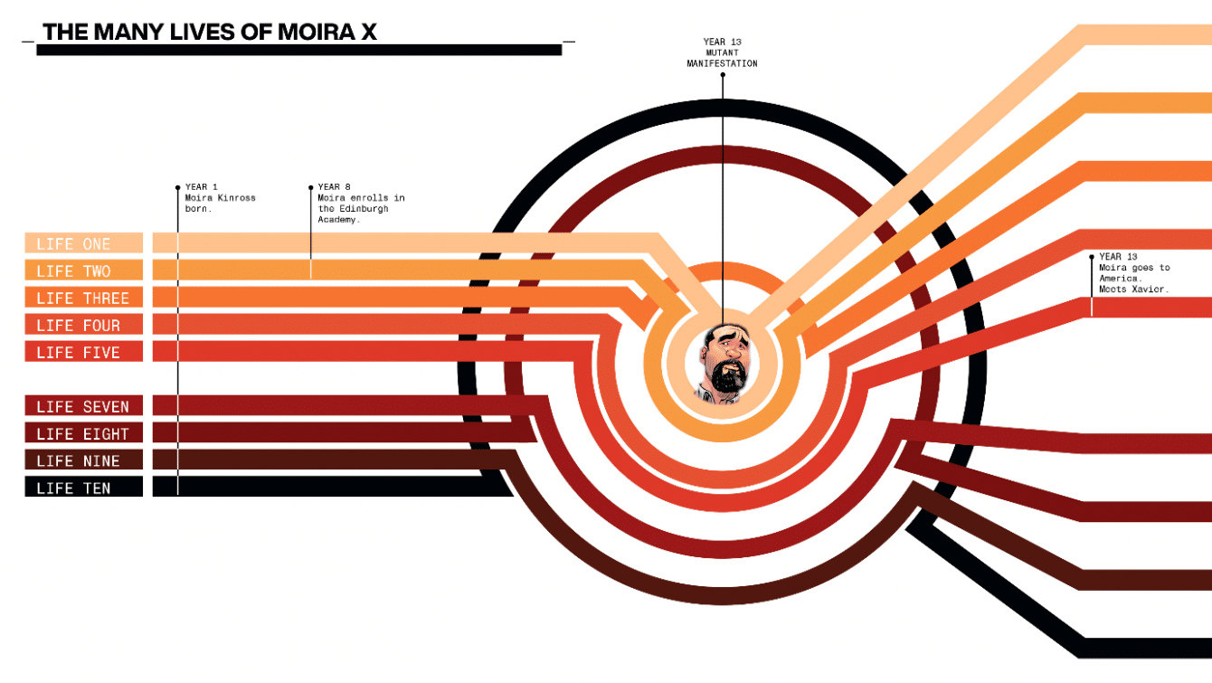
What I mostly do now, I do in an attempt to change the way the books are read and the way that narrative information is disseminated.
And, obviously, we’re going for an overall aesthetic as well.
ZJ: One of the biggest comics that I always looked back to as a precursor to these ‘data pages’ are Alan Moore’s diegetic prose pieces in Watchmen. Others have pointed to the 90s Marvel Trading Cards or The Official Handbook Of The Marvel Universe as early comics adjacent works that used similar concepts. Were there any works, comics or otherwise, that inspired your use of non-traditional elements in your comics?
JH: Sure, Watchmen. Of course. Five Years Later Legion [of Super-Heroes] . I also remember [artist Bill] Sienkiewicz doing those location maps in the Demon Bear issue of New Mutants. I love any time we can squeeze in a map.

There was also A LOT of really interesting text/image integration in the graphic design world around the turn of the millennium when everyone was using [Adobe] Flash like a hammer and no one cared how terrible the functionality was for a website. Tom Muller crawled out of that ooze, which makes it the golden years of the internet.
I’ve always told the Marvel guys that I want the books to be a mashup of a regular comic and a Marvel handbook.
So, I guess all that shit.
ZJ: Especially in House Of X and Powers Of X the ‘data pages’ serve as scene breaks. Often recontextualizing what readers just saw, or providing exposition for what readers are about to see. How do you go about choosing when to show your hand before a beat vs using those pages as a reveal? Are there other pacing and narrative tricks you have found that ‘data pages’ afford you?
JH: That how the Five Years Later, [Kieth] Giffen-[Tom & Mary] Bierbaum Legion book kind of worked. It had the Omnicom data pages in the back, and I think I remember prose pages in the middle of issue #7 (just checked, yep) when Mordru and Rokk are having dinner, and they were used as a way to change the pace. People talk about the density of that book in relation to the nine-panel grid, which is true — that’s a good way to pack a lot in each issue — but the narrative velocity of that thing was carried by the ‘data pages.’

Want to find out why the lightning brothers Mekt and Garth are getting along great and not mortal enemies like they normally are? Turn to the back for a very special data dump, because we are moving…forward.
The main difference between what that Legion was doing and what I tend to do is that most of the Legion pages reflected what had just happened in the issue — or it expounded on something that was referenced or glossed over. I do that too, but I also tend to use it to hint at things coming in future issues. Plant seeds and all that.
The point is, Kieth Giffen is a first ballot comic book hall-of-famer if I get a vote.
ZJ: What were the discussions around applying ‘data pages’ in monthly book like? Were there logistical hurdles you have to overcome to achieve that vision?
JH: That’s probably a better question for [X-Men Editor] Jordan [D. White], because I tend to get how things go down (line wide) screwed up, but I THINK everyone at Marvel just assumed that these other X-Books were operating like my books and just built it into the budgets.
I don’t think I ever said this is what you ‘have to,’ or ‘should,’ do, I think we just said you can do it if you want and everyone wanted a letter jacket, I guess.
ZJ: These ‘data pages’ have become a staple of the Krakoan era of X-Men, including books you are not writing. Was that something you envisioned for the line, something that the team latched onto as a story telling tool, or something else entirely?
JH: Well, we were certainly going to maintain the aesthetic of the line: The title pages, cast, what’s next, cover design, logo design, etc.
And if you were going to do the data pages, then you had to stylistically work within our design framework, but doing them was up to whoever was writing the book.

And look, full disclosure, I honestly can’t remember a discussion about an expectation of them, but I say a thousand ridiculous things a day, and I would not be surprised if one of them was: “I’m not telling you how to do your book, but if you’re not a moron, and you’re at all interested in a density existing in your book that’s comparable to the others, then you should consider not being a idiot and do this stuff.”
Again, ask Jordan. He’s got a journal just for my bullshit.
ZJ: Was there a learning curve within the group in applying techniques like this that aren’t so common in comics?
JH: Oh, I’m sure there is. And I’m sure some people think some writers do it better than others, but my feeling is that they should reflect the particular book and the particular creator.
A couple of them have surprised me with how clever they were. Others I thought gave too much away. Others I thought made the mistake of restating something from the comic pages. But overall I think they’re doing a good job and figuring things out.
ZJ: Designer Tom Muller is working with the X-Office on these. What is his level of involvement on a day-to-day basis? I imagine the ‘data pages’ that are largely text are just formatted by the Marvel production team but when there are charts and more unique graphical elements, is that something that the team follows a set style guide on or something Tom creates full cloth?
JH: Tom’s responsible for the top-of-the-line stuff. Specifically, Logo and Trade designs.

Everyone’s data pages are all put together by the bullpen who are working from templates we’ve created. If someone has a special design, like a map or something like that, then the bullpen will give it a shot. Occasionally, I do some of that.
ZJ: How do you approach scripting a ‘data page’ with design elements? Do you just describe it? Sketch it out? Attach an InDesign file?
JH: I do all of mine myself. I just upload a PSD file that the bullpen can mess with if they need to correct typos that proofing caught. Then they fold it into their prepress workflow.
ZJ: Is there a ‘data page’ in one of your books that really stands out to you (it’s the Ramen bowl from Decorum #1 for me)? What about in the books of one of your peers (it’s the Gwenpool sticky note from Gwenpool Strikes Back #5 for me)?
JH: Yeah, all that Decorum stuff is a lot of fun. It’s the first time that I actually hired a designer to handle everything for a book. Which was a big deal for me, because I can be a bit of a control freak. But Sasha (full name: Sasha E. Head, for Hire, dummies) has done a wonderful job with all that. Like, get the hell out the way, good. I kind of noticed how talented she was when she was still at Image doing Image +, and both Mike Huddleston (the artist on Decorum) and I just love what she’s done. Super, super talented and hungry.

I’m not going to answer the other part of your question because it’s like asking which of my kids is better looking. I mean, I know the answer, but no thank you.
ZJ: Why do you like circles so much?
JH: I actually don’t like circles at all. I’m just saving triangles for my imperial phase. Fingers crossed.
ZJ: Your Clemson Tigers meet my Ohio State Buckeyes in the Sugar Bowl tonight. Any predictions?

JH: Well, one team has never beaten the other, so if you’re going to lay some money on the game I’d take Clemson. And I’d do it regardless of how many points they’re giving up. But, you know, eventually Lucy has to let Charlie Brown kick that football, right?
Zachary Jenkins co-hosts the podcast Battle of the Atom and is the former editor-in-chief of ComicsXF. Shocking everyone, he has a full and vibrant life outside all this.


