The Nice House on the Lake is one of the best comics, especially in the horror genre, to come out this year. With the 12-issue series about to go on hiatus after a shocking midpoint cliffhanger, we thought we’d chat with co-creator and artist Álvaro Martínez Bueno about his process in creating such a well-defined but confined story and setting.
Ari Bard: What was the inspiration for the house? Where did you start?
Álvaro Martínez Bueno: We started looking at mid-20th century American architecture, looking for inspiration in very popular houses by Frank Lloyd Wright, Richard Meier, for instance, or Ray Kappe´s California houses and Ricardo Bofill´s Fabrica. We were aiming for a fairly large space which had to look modern but with a certain timeless air. It should undoubtedly be a cozy and warm space as well as being integrated into the landscape, with green areas inside and gazebos and large balconies overlooking the lake. But also we were looking for a strange, unsettling look to it, so we opted for a minimalist approach. After gathering many references and ideas, I started developing floor plans and views of the spaces which we discussed together until we found a basic structure to the house. However, this was not written in stone, we keep adapting the spaces for the needs of our story as we move forward.
Ari: You’ve collaborated quite a bit with James Tynion IV in the past. What kind of back-and-forth did you two have about the characters, the architecture and layout of the house, etc.?
Álvaro: We exchanged A LOT of emails (also with Chris Conroy, our editor) back in spring 2020 with references and ideas not only for the house but for the characters and the iconography of the house. James sent a description of the cast, and I started sketching pretty quickly. The descriptions were so clear that it didn’t take me much to come up with the appearance of the characters. I used real people as references, whether they were famous individuals or people that I know. I think most of them are also based on James’ friends, but he told me that after I was done with the designs. I know he showed them the sketches, but I ignored their reaction. I hope they liked them haha. We also put together a “wardrobe” and a Pinterest mood board for each character, which was revealed as a pretty useful tool for me. I’m constantly using Pinterest for almost everything, whether it is clothing, furniture or props.
Ari: One of the things showcased when having almost the entirety of a series take place in a single setting is how you manipulate space and our perception of it. The house can feel massive or claustrophobic depending on the panel’s tone or what you’re trying to show. How are you able to influence the space that we see?

Álvaro: At first I was obsessed with having everything nailed down. I even started doing detailed blueprints of the house with the goal of building a 3D model that I could use. But soon I realized that, even if the house is a key element of the series, this is a character story, so the house had to reinforce that somehow. This became clearer with the passing of the issues, so I guess I took the right choice avoiding to restrain myself very much in this sense. I obviously have a sense of the space and position of the characters in the scene every time, but this way I can “distort” the space and, for example, make it more empty, almost skeletal, or quite the opposite, lush and detailed depending on the tone of the panel. I’m kind of enjoying this freedom, and I hope I get to reinforce the acting or the characters’ emotions with this.
Ari: Similarly, because the setting is so contained, close-ups sort of become a default ingredient in the storytelling process, perhaps more so than many other books. You do a great job of keeping angles varied and really selectively choosing what to include in each individual panel and how to frame it in a way that keeps the readers’ interest, the momentum going, and the mystery moving forward. How are you able to balance that, and what is that selection process like?
Álvaro: Yeah, that’s something that has been a key part of my storytelling for years. I could trace a line to the work of Carlos Pacheco (one of my biggest influences) and, before him, to Gil Kane, Neal Adams, Gene Colan … they are masters of framing. I’m always trying to find interesting compositions, changing the focus to close-ups, insets, playing with the rhythm, giving graphic richness to the narration … that kind of stuff that keeps the reader interested but also keeps me interested while working. This said, I think it’s important to keep a balance in this and not lose the focus on the story. Eye guiding, flow, immersion, these are the most important things in the reader’s experience.
Ari: Another very unique element is how much some of your varied layouts seem to mesh seamlessly with AndWorld Design’s lettering. Whether it be the rather unique character descriptions/captions or some of the larger spreads with almost a rhythmic combination of small, close-up cuts and wider shots, all filled with dialogue, how did you plan and construct each page with all of the important elements of the house and the characters all moving about, while taking into account the lettering?
Álvaro: I know I’m giving Deron Bennett and the rest of the AndWorld team huge headaches with the placing of the lettering because I tend to fill up the pages very much and I publicly apologize for that, haha. I can’t be thankful enough for having them in the lettering duties. I try to be a few steps ahead with the blank space for the lettering, but I make mistakes more often than I’d like and they always seem to find the way to make it work. … The job they’ve done with the design pages is superb; they provide so much information to the reader while keeping it clear, exciting and modern and, also, they match my own visual choices (like the sketchy borders) to make the transitions seamless. … It’s just amazing.
Ari: I’ve noticed that this book has wide panel gutters and few defined borders. I think as a reader, it gives the effect of building tension while connecting scenes together and still letting moments breathe. What did this choice do for you and your art?

Álvaro: Yeah, that was something that was planned from the very beginning, I’m avoiding art bleeding and all the composition effects I used back when I was working in Detective Comics or JLD (Justice League Dark), like overlaid figures and stuff like that. I want all the action to be contained inside the panel because I’m trying to reinforce the idea that the cast is locked in a very unique place and situation and that all that matters for them is what happens inside it. This is the first time in my career that I’m making conscious decisions like this, taking away stuff instead of adding, and I think it served not only as a narrative effect but, also, it helped define the graphic look of the series.
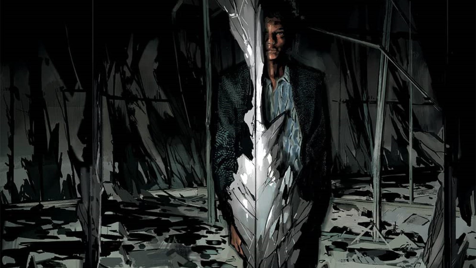
Ari: I think reflections are a key theme and component when it comes to the style of horror in TNHOTL. There seems to be so much detail involved with regard to how light shines through and reflects off of the sleek glass windows of the house itself, we see a lot of refractions of the lake and off various objects and buildings around it, and then there are other interesting effects with light like when you show the packages “beaming down” in issue #4. What is your process like for including all of these different effects?
Álvaro: That’s right, it’s an effect that we are finding very useful for our purposes. I’d say reflections in a story happening in a lake comes almost naturally, but we are playing very much with glass, mirrors, invisible walls. … I drew several shots looking into the house from outside through huge windows that helped me convey the idea of the reader almost peeking through the scene, as if they were someone spying on the cast. There’s an aesthetic component to it, I really like the general mood it generates but we also have used it often narratively to show hidden aspects of the characters, secrets still unrevealed or potential threats to them. … On a technical note, since I work all digital these days, I try to draw all these reflections or lighting effects on separate layers so Jordie Bellaire, our colorist, can also play with them.
Ari: Obviously the characters are also extremely important in addition to the setting. For you, what’s the most important part of drawing a character?
Álvaro: To make it look alive, whether it’s a superhero, an alien warlord or a Brooklyn barista. My obsession with this has particularly ramped up with this series. As I said, this is a character story, and I usually find myself with a script that’s 22 pages of regular people interacting, with a huge array of feelings, each character with his/her own body language, complexion and gesturing. I knew that I had to up my game not only in all these manners, but also in consistency of the figures page after page, in conveying clothing or hairdos that looked real and fitting for the character. … I know I can get better in this, and that’s what keeps my mind busy these days!
The Nice House on the Lake #6 comes out Nov. 16 from DC Black Label. Vol. 1, collecting issues #1-6, is scheduled for release March 1, 2022.

Ari Bard is a huge comic fan studying Mechanical Engineering so he can finally figure out how the Batmobile works.