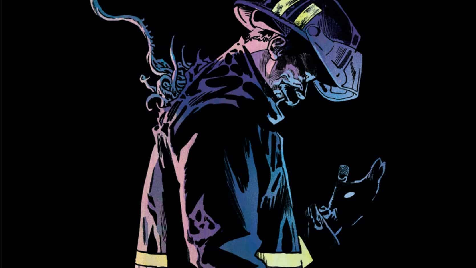
The Silver Coin continues as an ongoing series. The kid has been losing serious quarters to the arcade’s hot new fighting game. But when he finds the Silver Coin, he just can’t stop winning — no matter how bloody the game gets. Issue #6 is drawn and lettered by Michael Walsh and written by Josh Williamson, with a backup story written by Chris Hampton and drawn by Gavin Fullerton.
Mark Turetsky: Time passes. The coin finds its new victim. Speaking of: Hey, Ritesh! Welcome to coverage of The Silver Coin!
Ritesh Babu: Hello! I believe this is both my first Silver Coin issue and write-up! I just read this one, and none before, given each issue has a different creative collaborator for Walsh, with a different scenario and premise. Should be interesting!
Test Your Might
Mark: This time we have Joshua Williamson on writing duties. I have a confession to make: This may be your first Silver Coin, but it’s also my first Joshua Williamson comic.
Ritesh: Well, I wish I were you, Mark. I wish I were you. For this is just among the many JW comics I’ve read over the years. That said, thankfully, it is not as poor as most of them.
Mark: Wow, coming out swinging already!
Ritesh: Coming into this, all I knew was that it was basically akin to an anthology built around the titular Silver Coin in the title, as Walsh basically jammed out with his creative pals each month. And what I did like a lot is how I could just jump into this and read it, without any worry or sense of “Oh, did I miss something?” I dig its tightly bound, self-contained nature.
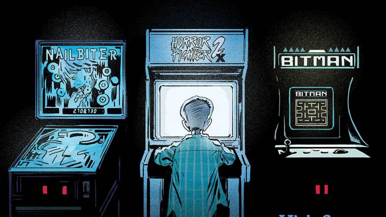
Mark: Yes, aside from that one mention of the summer camp (which we saw in issue #2), this one stands on its own. Now, you’re a bit younger than I am; are you familiar at all with the controversy in the ’90s about violent video games, specifically Mortal Kombat?
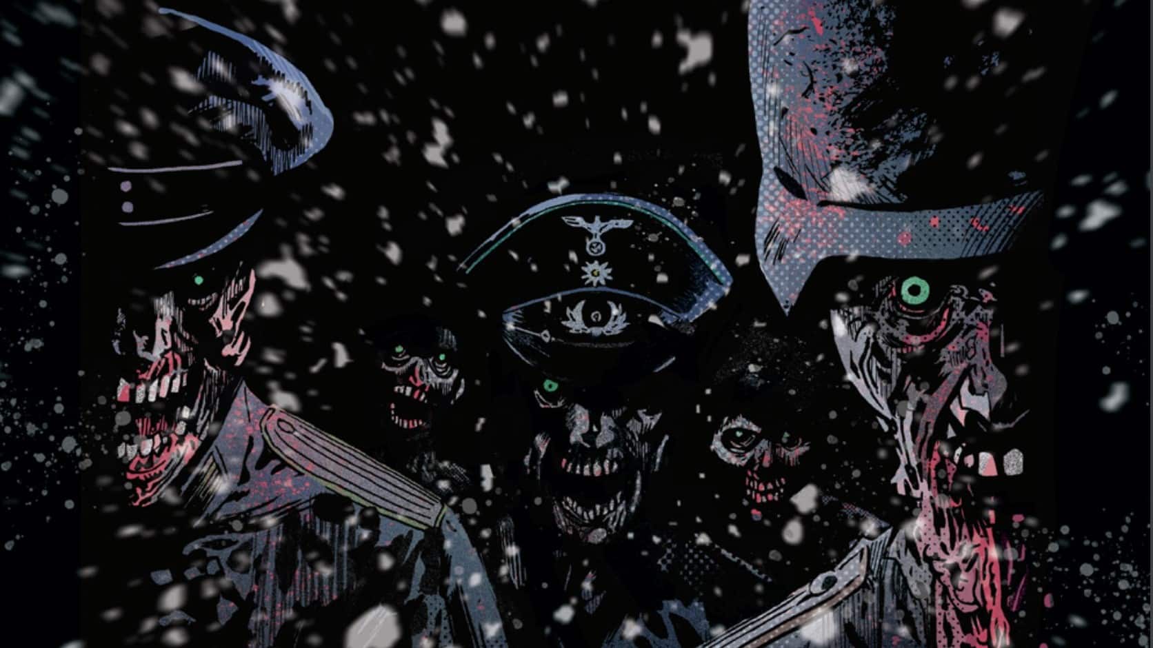
Ritesh: I’m aware of it, yeah! That was the big thing that immediately struck me, the sort of throwback, setting this in an arcade and with the kids in the background talking about/referencing Death of Superman as a hot new present-day thing. It’s situating you in that ’90s context, so I was like, “Oh, huh! Interesting!” It’s why the eventual arrival of Spawn is quite fun (and shocking!) as well. But thinking on it, it makes sense.
Mark: Yeah, the book tends to ground itself really well in the time period each story gets set in. Here it’s the mall as a social hub, the arcade, the video games getting more and more graphic to pollute those impressionable young minds. I loved the fighter selection screen, with Spawn, the Woman in the Red Dress from Department of Truth, even something that looks like Zombie Pirate LeChuck from the Monkey Island games (those were much more my speed at the time).
Anyway, it wasn’t just violent video games that were blasted across the media as corrupting influences: There was a huge amount of performative concern about Power Rangers, which, when you look back at it, was just kinda goofy, campy fun. But this issue really taps into that ’90s paranoia that violent media was going to turn all the kids into sociopaths, and warps that out grotesquely.
Ritesh: It makes sense to me that this is the issue Williamson would write, in a sense. He is very much a horror guy and horror writer. It’s why the cover even has a Nailbiter allusion with the arcade game. And he is very much a product of the ’90s and so much of his comics are just awash with that influence. If Donny Cates is all the Rob Liefeld and Todd McFarlane metallic excess and violence, and Steve Orlando is all The Weird Stuff of the ’90s, then Williamson is kind of the more baseline flavor. It’s his time and era, it’s the era of comics all his work is most nostalgic for and trying to recreate and recapture. To return to it in a horror story, via the rhetoric of that period, that makes sense to me.
Flawless Victory
Mark: And I think he does it pretty effectively here. My main draw to this series is Walsh’s art. The ultraviolence is fun, but the way he captures that vacant look in the kid’s eyes, the bluish glow of the arcade cabinet lighting everyone’s faces, contrasted with the reds of the gore. The scenes in the arcade are almost black and white with their desaturated darkness. I’m also tickled by the video effect he places on the opening scene within the fighting game. That ax guy with the baby mask is the star of a summer camp slasher movie in the Silver Coin universe, so it’s nice to see our old friend return.
Ritesh: Walsh is absolutely the unquestionable star, yeah. He’s the guy at the front of the band, and he is The Big Draw. I rather adore those big striking video game SFX like FIGHT! SLAUGHTERED! They’re just bathed in these red hues, and particularly when the SFX isn’t embedded inside the panels, but leaps over them to be on top, subsuming them like a dark proclamation hovering above all? That’s the good stuff. Walsh does the pencils, the colors and the letters, and it’s hella fun to see his cartooning talents on display here. His lighting work is stellar, as you’ve noted, and just, above all, he sets such a perfect tone for this. The comic reads quite fast to me, and I mean that in a good way, because it moves, you’re not bogged down, and Walsh’s visual prowess is allowed to do the storytelling. It’s quite fun. We don’t get enough artist showcases like this. We get them all the time with writers in comics, as artists are largely treated as disposable quantities, replaceable at any turn. So this is a thrill, in my book. All I can think while reading it is “Wow, what a flex.”
Mark: Which is kind of nuts in comics, of all mediums, right? We get so many anthologies with one writer and rotating artists, so it ends up looking like a hodgepodge of disparate elements. Silver Coin has a real consistency to it. The settings, the genres (Well, usually some genre with a -horror tacked onto the end), the tone, they can all change with the writer, but if you pick up a collection, you can flip through it and it’s all consistent, visually. Even the Gavin Fullerton-drawn backup in this issue isn’t too far off from Walsh’s style. If you’re unaware, Ritesh, Walsh was injured while making the first run of Silver Coin, and Fullerton stepped in with some art assists on issue #5, but Armaan and I couldn’t spot any seams where that showed. What’d you think of the backup story here?
Finish Him
Ritesh: The Chris Hampton/Fullerton backup was another case of the book absolutely being an art showcase for me, which is absolutely not a negative. Getting to see Fullerton’s trees caked in blacks, like they’re made of shadows, against a cream-yellow colored sky, all the textured detail put down with a brush, the dynamism of the angle and the close-up shot used for a splash page. That’s the thrill for me here, yet again. Fullerton also nails the horror for me, wherein you see that first panel with the kids, and you see that big open wide mouth, and immediately you’re like, “Oh, this is a horror story.” You can draw scary sceneries or animals and creatures, but it’s really how you draw the real, human people and expressions for me, and you see that wide mouth and there’s something eerie in how something ordinary and mundane is presented there. The thick lines used, and the kid behind that main figure being much more minimalist, with eyes not being shown. They’re just lines. It’s a very specific presentation, and it worked for me.
Mark: Yes, that huge contrast you get in the forest on a sunny day, and finding the grotesque in the everyday. The adolescent kid’s mouth with missing teeth, the kids laughing at the scouts falling out of the tree. And the poses of that scout leader! It’s such a fine line that Fullerton walks between cute and monstrous. And that final splash, where it’s not just shinies in the crow’s nest, but also a human thumb! It’s real good stuff! I would also be remiss if I didn’t point out that the flashes of scenes on that eight-panel page seem to be a mix of scenes from stories we already know and stories we’ve yet to read, including a hand holding cards, which appears to be from next month’s story, “Tzompanco,” written by Ram V.
Ritesh: “Cute and monstrous” is a good way of putting it, yeah. And I am extremely interested in that Ram V collaboration with Walsh here, as he’s a writer I think is exceedingly good at writing to his collaborators’ strengths.
But also, looping back to the main story, I should note: I rather love the ending implication that all the characters IN the game are potentially real individuals who just played the game and got trapped within it. Which is to say, the notion Spawn went through the same thing this kid did. So did The Red Lady from Department of Truth. All of them gamers, all of them trapped in this whirlwind of violence.
Mark: Poor Count Orlok! He’s been stuck in the MK knockoff since 1922!
Loose Change
- I wonder if the person who tossed the Silver Coin into the fountain at the mall got their wish?
- I love the game-control panel rod just being pulled out and turned into a weapon. What an incredible image.
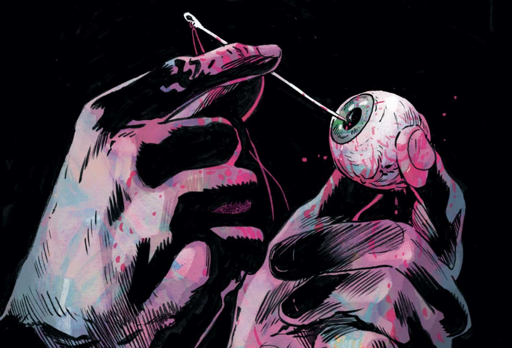
- Ditto impaling that older teen’s eye on the joystick. Eye trauma is a real theme with this series.

Mark Turetsky

Ritesh Babu is a comics history nut who spends far too much time writing about weird stuff and cosmic nonsense.