Austin Gorton: This year marks the 30th anniversary of the release of the inaugural series of X-Men trading cards, all featuring art from superstar artist Jim Lee (30 years?!? God, I’m old). To celebrate, Abrams ComicArts recently released a hardcover collection of the 100-card set, presenting the cards (front and back) on slick paper (slightly larger than the originals, but not so large that the intended presentation size is completely lost). As a big X-Men fan who remembers cracking packs of these cards in the backseat of my mom’s car on the way home from the comic book store, and someone currently tweeting out a trading card every day (currently from this same set of cards, not coincidentally), this kind of book is right up my alley, and I was excited to check it out.
Adam, as a fellow X-Men aficionado, co-host of Battle of the Atom and an artist who created a set of his own trading cards inspired by these cards, I imagine the same is true for you?
Adam Reck: The Jim Lee X-Men cards represented all that was good with the world for me in 1992. A halcyon time of local comic stores in every town at the height of my kid-brain’s excitement for the medium. And it is really weird how comic book trading cards were a huge part of it. I had piles of cards featuring poorly reprinted artwork from Rob Liefeld, Lee, etc. I recall hunting with great fervor for glow-in-the-dark Ghost Rider cards, despite not really reading the book. I had been gifted the collector’s tins of Marvel Universe Series I & II, and Art Adams had done a lot of the artwork for the second set, but to have Jim Lee, the biggest artist in the comics universe at the time, take on an entire set? That was a big deal, and he delivered in spectacular fashion.
I do own the original complete set of cards, including the holograms (except for the pesky power level card since I did not get the collector’s tin). In ’92 I waited close to five hours to meet Lee at a New York Comic Book Convention and had him sign the Wolverine card. To say I am the key audience for this book may be an understatement. Which is both a pro and a con for me when looking at the actual book.
Austin: I’ve written before about how comic book trading cards were my gateway to the world of comic books proper, and this set of cards came about just after I started reading comics – specifically, the X-Men – on the regular. Which both helped widen the world of the X-Men for me (There are many characters featured in the set whom I met for first time in the set) and made this (ultimately very short) era of X-history, the post-Claremont/pre-Image Exodus Blue & Gold Team proper era, feel bigger and more lasting than it actually was.
Kudos to you for nabbing all the hologram cards; I still have my complete set of the regular cards but only have a couple of the hologram chase cards.
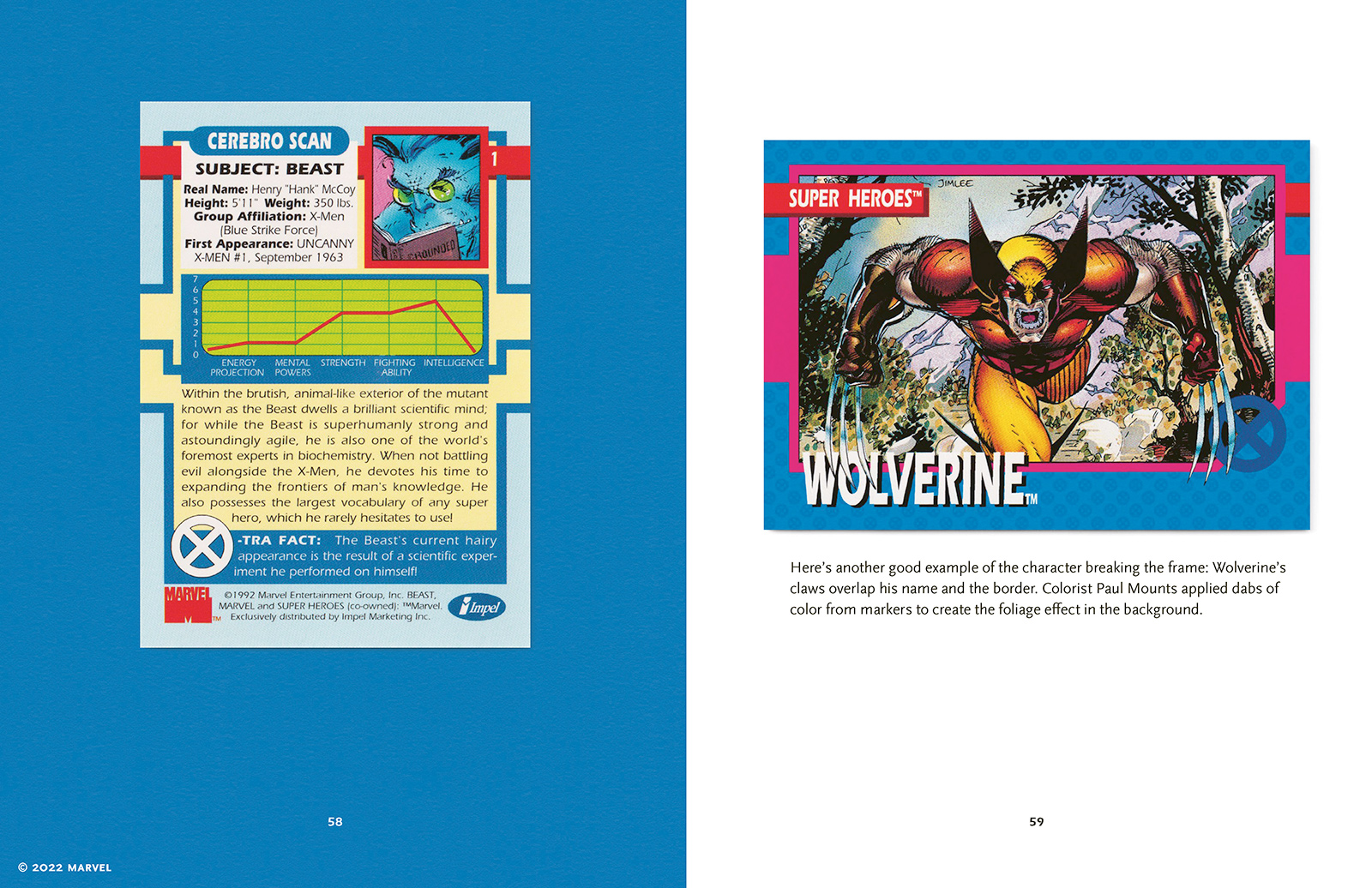
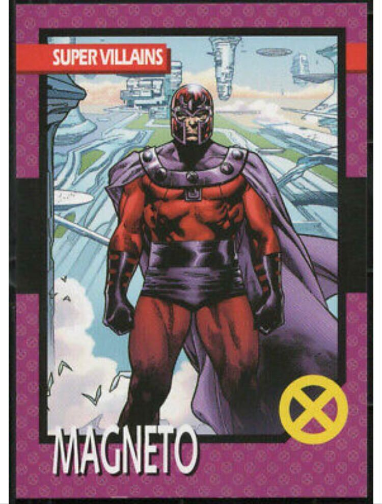
So getting into the book itself, the main event, so to speak, is the presentation of the cards. Each card gets its own page (front and back), blown up to a size slightly larger than the actual trading card, but also not so big that the scale of the artwork gets out of whack (like in the comic book-sized collected editions Marvel released a few months after the set went on sale). What did you think of this presentation in the context of the book?
Adam: I like the presentation of the book quite a bit! Having obsessed over these cards for so long, and knowing them as well as I do, Abrams did an excellent job in presenting the artwork without (as you just mentioned) blowing it up to full page size, which it was never meant to be viewed at. If I have a quibble, it’s that the book only showcases some of the original artwork in the introduction. Quite a bit of Lee’s pencil/ink artwork is available out there, and I wish more archival hunting had been done to present that with the cards. I say this as the kind of person who spent a good year tracking down forgotten Mutant Genesis promo art by Jim Lee and Whilce Portacio in hard-to-find comics magazines of the ’90s. I want more than what I already have in a retrospective like this.
I do appreciate that they included cards like the checklist, the power rankings card and examples from the cards that were used for promos or in the Toy Biz action figures, but it would be great to see some of these variants next to the original cards. The thing I was most surprised by was there was no original artwork for the hologram cards! The scans of the holograms are accurate, but the cards themselves can be blurry. It would have been a great opportunity to blow up the color artwork that was featured on the backs of the cards. I know they exist because they’re printed in full along with the rest of the set in the Jim Lee X-Men Omnibus Vol. 2.
Somebody is reading this and thinking I’m being nitpicky, but I think it’s worth thinking about who this book is for and what purpose it can serve.
Austin: There’s definitely a bit of expectation management at work. I went into this hoping there’d be SOME context aside from the reprinting of the cards themselves and a token introduction (There is one of those; we’ll get to that), so when the final product includes the extra stuff it does — the aforementioned promotional material, stuff like print ads and sales sheets and retailer posters — I’m just happy to get something. But you make a good point about including the original artwork (one bit of artwork, the pencils for Rogue’s card, gets reproduced, but that’s about it), which would have been neat to see just from a process perspective (especially for the hologram cards). I do wonder if some of that comes down to who possesses the original artwork, and whether Marvel/Abrams could even access it, or if Lee still has it all.
In terms of that added content, the book does feature a 40-ish page introduction from Bob Budiansky, who was executive editor of special projects for Marvel at the time and oversaw the creation of a number of the initial Marvel comic book trading cards. Budiansky chronicles the creation of the cards, from inception (following the success of the first two Marvel trading card sets in 1990 and 1991, it was decided to release three sets in 1992, one of which would focus on a specific group of characters, with the super-hot X-Men the obvious choice) to design (including the decision to replace the previous sets’ “Power Rankings” bar graphs and “Did You Know?” factoids with a line graph “Cerebro Scan” and “X-Tra Fact” to highlight the specificity of the set) to creation (Budiansky discusses recruiting Lee and having to get X-Men editor Bob Harras’ permission to let him work on the set; Harras, for his part, was worried about Lee meeting his X-Men comic book deadlines but ultimately agreed) to marketing and, finally, release (at which point Budiansky shares the reactions to the cards from a handful of fans).
I don’t think he said anything jaw-dropping or surprising, but the way the creation of the series and its context within the comic book media landscape of the time are laid out elevates the book and enhances the experience of flipping through the card art.
Adam: Budiansky’s explanation of the production process is the main draw here. He goes into great detail about the variants, what was being asked of Lee and how these things actually got made. What follows in the way of commentary with the card reprints is nice. It also feels somewhat sporadic, and here is where Lee’s absence is felt the most. I assume mainly due to his exclusive contract with DC, Lee couldn’t be involved with a project like this, but not hearing from him in the notes is a little like listening to a Blu-ray commentary track without the film’s star. Marvel has gone back to the well on this artwork time and time again, most recently with 29 recolored variant covers on Marvel books in 2017, and each time, Lee sees no residual money from it that I know about. So a book like this that tries to place the series in the historical record is cool but ultimately remains incomplete because of massive conglomerates being at war for eyeballs. It’s ultimately pretty silly when an artist isn’t free to comment on their own legacy.
And in that empty space, we are also given an introduction by cartoonist Ed Piskor. I can imagine this project has been in development for a while and that Piskor was selected due to him making X-Men: Grand Design. Unfortunately, since Grand Design, there has been renewed criticism of Piskor’s work, and his latest project, Red Room, gained negative attention earlier this year when a variant cover parodied Art Spiegelman’s MAUS. Opinions of Piskor the person aside, he doesn’t offer much more context than you or I could in terms of an introduction. He was young, he bought and was excited about this stuff, and looks back on it fondly. Especially after Piskor concludes his introduction with a backhanded compliment of Lee and inker Scott Williams’ work (“a bit constipated,” “plastic looking”), I was wishing for another creator to share their nostalgia.
Austin: Yeah, given Lee’s current position at DC, his exclusion here is ultimately understandable, but no less unfortunate.
The Piskor foreword is indeed wasted space (at best). Squint, and you can see what the book’s creators are going for: showcase a high-profile fan who can talk about the cards from the same experience and with similar words as the way potential readers experienced and talk about them (which is to say, the fact that his context is the same as our context is probably viewed as a feature, not a bug). But when you combine that relative emptiness (however intentional) with the larger issues surrounding Piskor and his occasional, as you say, too-cool-for-school asides (his closing remarks taking unnecessary potshots at Alan Davis’ Excalibur personally irritated me), it creates a lasting impression that a better person could have been selected to fill that role.
In addition to the book itself, though, there are a couple of extras included, both of which I think are pretty neat. First, appropriately enough for a book about trading cards, are four new trading cards exclusive to the book, a triptych recreation of Jim Lee’s connecting X-Men (Vol. 2) #1 variant covers and a one-card recreation of the nine-card Danger Room “puzzle” from the original set. What’d you think of these?
Adam: I love the new trading cards. They are done really well, and they even have the reflective shine on the tiny X’s in the border. My only wish is that they had also gone the extra step to create the reverse of each card. Instead there is what feels almost like a disclaimer about these being generated exclusively for the book. I understand why they didn’t. Creating a truly exclusive set of cards that served as an addendum to the set instead of an added feature to the book would mean people buying the book solely for the cards and for reselling them, but I’m sure folks will do that anyway. So while it would have been cool if Abrams went the extra mile to make them as authentic as possible, I get the strategy.

For those obsessed with the original set of cards, they’re a nice addition that won’t set you back as much as the 2015 Fleer Retro X-Men cards or the 2018 Fleer Ultra David Nakayama X-Men ‘92 cards. I added them right to the set with the others.

Another fun “hidden” feature is the inside of the dust jacket, which is the inside fold-out illustration from X-Men #1 featuring all the current X-teams. It’s another beautiful reprint of classic Lee art that, if you’re not planning on keeping the dust jacket on, could be framed.
Austin: That reverse-dust jacket is a great touch. It’s the kind of thing that, for all the flaws and nits we might pick, shows that the people who put the book together were genuinely trying to make the best possible package for fans. While this definitely seems like a one-off tied to the 30th anniversary of the cards’ release and not the beginning of a series, I’d love to see more books like this, which both re-present the cards while also digging into the backstory behind their creation (even for something more modern like those hideously expensive and hard to find 2015 and 2018 sets), especially if a wider net is cast to pull in more of the actual artists involved and more of the original art.
Adam: I would love to see this format with more series. Topps has done something similar in really nice editions for Wacky Packages, Garbage Pail Kids and Star Wars, so there is definitely a market for this stuff. And there’s a huge library of these cards from over the years, so I guess we’ll see! At least in the short run we do have this fun book celebrating a landmark achievement in comic book history!

Austin Gorton also reviews older issues of X-Men at the Real Gentlemen of Leisure website, co-hosts the A Very Special episode podcast, and likes Star Wars. He lives outside Minneapolis, where sometimes, it is not cold. Follow him @austingorton.bsky.social.

Adam Reck is the cartoonist behind Bish & Jubez as well as the co-host of Battle Of The Atom. Follow him @adamreck.bsky.social.