A classic tale of chivalry, courage, and inevitability with John Reppion and MD Penman’s Sir Gawain and the Green Knight.
Ritesh: ‘Tis the season! Of yuletide tales and gift-giving! And so we come to a tale of old–The Tale of Ser Gawain and the Green Knight. Crafted with great care and intense research by John Reppion and Mark Penman, it’s a fresh new Graphic Novel that’s about 50 pages and retells the entire tale for a fresh new audience. And it even comes with an Alan Moore introduction to boot! So much to talk about here!
Shall we get started, Rob? Let’s kick off with the Alan Moore opener. I know you have thoughts on that.
Rob: Newcomers to Arthuriana will find a lot of useful information in his introduction. A lot of people assume, in my experience, that “King Arthur and the Knights of the Round Table” is one specific set of stories, a relatively stable collection of legends. This isn’t really true; as Moore explains, the stories “have been collaged” over time by pagan, Christian, and post-Christian writers across centuries. There is no true Arthurian past in England’s history; there was no time quite like that we imagine when we think of Arthur. It’s an imaginary time cobbled together by all these different authors, and so, Moore argues (and I would agree), the best adaptations and retellings of the material today “resolutely place themselves in the pure world of storytelling that its various narratives originally sprang from, unconcerned with worldly history.” It’s a very fine, and again, very useful introduction.
Ritesh: Yeah. It’s kind of why it’s amusing when someone like Zack Snyder says ‘I’m going to make a faithful Arthur adaptation’. It’s like ‘faithful’ to what or whom exactly? The Vulgate Cycle? Tennyson? Mallory? White? It’s very much an iterative mythos that shifts and transforms depending on the set of hands it’s in. That’s kind of the whole appeal, really. It’s what makes it beautiful and horrifying. It’s how and why it can be nationalistic drivel in one set of hands, and something much more subversive and smart in, say, Kieron Gillen and Dan Mora’s hands.
Rob:The one thing that bothers me— and perhaps I’m missing some context here from Moore’s work— is his overly narrow description of that collage, framing Arthuriana as really coming into being when the “Christian mythologist Geoffrey of Monmouth [collected the stories] into his Grail-centric ‘history.’” There’s a story in Geoffrey of Monmouth’s work that might have influenced the first story which introduced the Grail (Chretian’s Percival, ~1190 CE), but in no way is his History (~1163) “Grail-Centric.” The Grail wouldn’t become central to Arthurian legend for quite some time; in Chretian it’s not even yet the cup that caught Christ’s blood. It’s just a mysterious bowl. Later it would become a jewel from Satan’s crown, and eventually would resolve into the image we know today. It’s not the 12th century History, but the 13th century Vulgate Cycle that I think cements the Grail as so central to the Arthurian legend. I say all this not because I’d like an opportunity to um akshully Alan Moore, a man who I am sure is far better read than I am, a mere Arthurian Enthusiast, but I think this mistake (or what appears to me to be a mistake) would undermine his point (and Reppion’s in the afterword). They both wish to show that Arthurian legend is a strange, timeless but unstable thing, a myth that accrues across many authors. They want to show that this comic is the same kind of activity as the Pearl Poet’s when he wrote Sir Gawain and the Green Knight. I think that’s undermined if you place Geoffrey of Monmouth as this ultra-central figure, when the truth is that he was one of many collagers.
Ritesh: Yeah, that’s very true.
And I think that’s what stands out as the strength of this. It is clearly rooted in a tradition but is at once its own interpretation. The aestheticism Penman deploys throughout feels very appropriately evocative of a classical sensibility that one might attribute with medieval art, whilst feeling wholly contemporary. The opening is a good example for me, wherein we begin on Aeneas and get to Brutus Rex and The Kings Of Britain. It’s laid out like detailed wall paintings, with cracks and all, or the kind of detailed thing someone might painstakingly embroider on cloth as magnificent art. An art to tell a mythic history–that of this land and its once and future king.
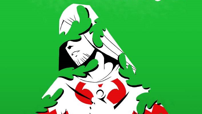
Rob: I adore too the subtle shifts on that first page. There’s a unity there — I agree that it feels like finding an old fresco on a cracked wall — but each panel changes something too. That opening panel feels like something you’d see on ancient Greek pottery. The second, very similar, but now something more like an illuminated manuscript. The iconography is still simple, but it’s a little less abstract, and the contrasts are not as stark as you’d see in Greek art. And then in the third we get the style of the comic moving forward, retaining some stylistic elements from the first two panels but with modern perspective and composition, and with expressive coloring. If we’d just jumped in with the style of the second page onward, we’d be able to see the elements Penman is pulling from Medieval art, but bringing us in so gradually, one step at a time, really makes clear those connections. There’s also a procession of color: red, black, and some white, then red, black, and white, and finally a black and white landscape, with a hint of red shining out through the windows of civilization, and for the first time a green shadow falling across the snow from something outside. It’s a wonderful way to introduce this story about a natural, supernatural, or alien force entering and disrupting court, the place of order and civilization.
Ritesh: The colors are maybe the standout part of this whole thing for me. I love the blood-red of Britain (and its knights) which is contrasted by the grass-green of the Green Knight and the rest of the natural world. The King, the knights, his court, they’re all bathed in reds. And the red pours out as blood during carnage and violence. Whilst Lord Bertilak/The Green Knight, the hounds, other manner of natural things are green. And it’s this clash of colors that really gives the book a striking visual personality that I really enjoy. It is a lovely little illustration of what’s going on here.
It is a challenge between the ideals of two supreme forces. One imposed and constructed, and one of the fae, of the world of the wild lands of this island.

Rob: That sharp contrast is entirely what makes the poem special to me. Many Arthurian Romances feature knights leaving court and entering the wild, and, eventually, the fae. The poem begins with the intrusion of a faery force into the social world of the court, and then by the end that same force has been revealed to be a mask, a knight of the ordinary world, while at the same time Sir Gawain’s ordinary place of refuge is revealed to be part of the fae game. I loved Lowery’s The Green Knight, but I think this is where that adaptation ultimately failed for me. The poem abridges all of Sir Gawain’s wanderings because all that adventure isn’t the point. The poem focuses on the seemingly ordinary situation Gawain finds himself in, where he must use the knightly value of courtesy to avoid both displeasing the lady of a house and betraying the lord. The reveal recontextualizes all of this at the story’s end. The film instead focuses on Gawain’s wanderings, abridges the gift-giving game, and ends prior to the reveal. It’s a movie that for me really captures the spirit of Arthurian Romance generally while failing to capture the excellence of the poem in particular. I imagine a similar road would be tempting in this comic, to give Penman the space to explore all the wild monstrosities that populate these legends, but instead the comic exercises restraint, restrict Gawain’s journey to three pages of montage. The focus on the gift-giving game is retained, and Penman’s absolutely wild Sir Bertilak delightfully evokes the uncanny joining of fae and court that I think is so central to the poem.
Ritesh: Yeah, I liked that the comic, particularly given its limited real estate (it’s not a 120 page OGN, it’s not 200 or 300 pages), knew exactly what to focus on, and what exactly was most dramatically compelling about the poem.
Which is The Test Of Gawain. The disgrace of Gawain. The failure of Gawain to uphold his almighty ideals of knighthood. To prove to readers all that even the most noble and well-meaning of knights was fallible, human, and would in the end betray the creed he supposedly held strong to. That in the face of self-preservation ideals would and indeed shatter. And when Gawain ultimately returns home to Camelot, distraught, the discovery that he’s not alone, as every one of the knights also bears their own green-band of shame? It’s revealing.
Rob: That’s by far my favorite addition the comic makes to the tale. For readers unfamiliar with the story, the Pearl Poet has the court of Arthur all adopt the decoration of the green band as a way of both comforting Gawain in his failure and of honoring him for his humility. This ending I don’t find better so much as I find an interesting alternative. I feel it lifts the story into something archetypal, and though it removes some ambiguity (is the court learning the lesson it should from Gawain’s failure, or is it treating his failure frivolously, showing some weakness that will eventually lead to its destruction?), it evokes that sense of timelessness Moore discussed by establishing such a cycle of temptation.

Ritesh: It’s a yuletide tale of truth about these chivalric heroes of the realm. That they are all bound not just by their almighty words and oaths, but also by their grand failures and humanity. That though their words and swords might be almighty, they themselves are not. They are people yet. They are mortals still, encased in armor that misdirects from that truth.
Rob: Which reminds me of the other major change the comic makes, another I very much enjoyed. The aftermath of the beheading game is much more ambiguous here than in the poem. Appropriately for such a wild Bertilak, the unmasking of the Green Knight is no longer a moment of peace and safety, of a restoration to civilization. Instead it is a last moment of temptation and danger. Sir Bertilak isn’t an ordinary man englamoured by Morgan LeFey, but a creature whose humanity is questionable. It is unclear if Bertilak or the Green Knight is the mask, or neither. The knights of the Round Table are deeply human, but we leave this comic not knowing what this thing is. Gawain himself flees as the Green Knight bellows out an offering to remain in Faery forever.
Ritesh: I love how the story is able to quickly go from quiet and subdued to wild and loud. A great example for me is the splash page of the bleeding fox and the blood falling down upon a seated Gawain. Or even better- that double page spread of the Fox-Knight upon a scroll held by Bertilak/The Green Knight. Gawain is a trickster, a liar, a deciever of his own host, thus making that motif quite fitting and perfect. The cunning of a fox is usually viewed in a negative light, and it’s ultimately what Gawain’s deception is presented as. A self-centered cunning that is not clever or impressive, but a failure and a failing. A display of his very essence that is in the end not so glamorous as the exterior and titles he bears suggest. It is Morgana Le Fay and her victory of the fae upon the knights and the court.
What did you make of the rhyme/meter of the work and how it tries to translate that from the poem to comics, Rob? Comics and Poetry I think are a really interesting link, and they have more in common than people realize. Both rely so strongly on rhythm, and it’s the basis of how they work.
Rob: I’m of two minds here. On the one hand, I think the narration is really compelling, and overall gives the reader a good feel for what Gawain’s alliterative lines feel like. That’s the mark of a good poetry translator, I think. Even if you can’t capture the exact same meter, give the reader a feel for the verse’s movements. On the other hand, I think there’s a significant missed opportunity here. The verses are organized in a simple ABAB rhyme scheme. Sir Gawain and the Green Knight has a distinctive “bob and wheel” structure, where at the end of longer unrhyming alliterative passages, the poetry shifts into a rhyming form. It’s such an odd thing, and it’s another example of the kind of cobbled-togetherness we find in Arthuriana. It’s a little bit Old English epic, a little bit Medieval. It’s two different worlds and two different kinds of poetry smushed together. I enjoyed the writing in the narration, but I would have preferred a more complicated approach to the verse, something that shifted and changed like the poem does. There’s opportunity in the comic too to replicate that kind of changing pattern in the panel structure, an opportunity not seized here. That said, just as the verse is very enjoyable as-is, so too is the visual structure! My favorite layouts come towards the beginning of the tale, as we see the passage of a year in the wilting of leafy panel borders and in the growing distance between the page and Gawain, or, two pages later, when the Pentangle is explained in narration and expressed in what at a glance might appear to be panel gutters across the page. (and, sidenote, how glorious to see the pentangle, when space is at such a premium here, to be explained in full and given an entire splash page!)

Ritesh: That was absolutely delightful, yeah. The layouts in general are really good and Penman’s artwork is great. Reppion’s translation is something I did very much enjoy, and the narration is a strong point, for sure. I really love how it’s lettered, in particular. The font used really fits and suits the style here. It feels transportive to this classical timeless epic of myth and legend. The stylized font there and in moments of heightened dialogue- like a scream- are terrific. I even love the SFX work. But I will say I found myself confused by the regular lettering font for the dialogue otherwise beyond that. It kept pulling me out at times when we went back to it from the stylized captions with narration. It felt a bit too much like almost a stock/default choice. The rest of the comic, from the artwork and coloring choices and captioning are all so stylized and deliberate, that this choice felt rather strange to me. It’s the one thing that didn’t work for me, and I wish they’d used another different, more stylized font for the speech as well. That’s probably my one gripe about what I otherwise found to be a thrilling, lovely modernization and take on classic material.
Rob: I would agree; at the very least, when the Green Knight speaks in verse, something should set it apart. As you say, though, it’s an incredible modernization. It is grounded in an understanding of the text, conveys the experience of reading that text to the unfamiliar reader, and builds on that text in interesting ways for the familiar reader. I very much look forward to adding a copy to my Arthur Shelf.
Ritesh: Yeah. The afterword by Reppion, with a whole page of sources listed, and tons of details and process and explanation for choices made, is a display of the sheer work put into this. It’s very clearly a labor of love and care, with tons of research done, and I think it comes out to a very satisfying spin on the material it tackles. Lots to like in there, and absolutely something worth grabbing. It’s a grand ol’ time.

Ritesh Babu is a comics history nut who spends far too much time writing about weird stuff and cosmic nonsense.

Robert Secundus is an amateur-angelologist-for-hire.